Editing Poses
There are only three disciplines at Seeing Stars which require edited poses: In-Hand, Advanced In-Hand, and Showmanship. In the rest of the disciplines which allow editing, it is optional and you can choose to just show regular unedited poses if you wish.
Sometimes, members might have a pose editing service, in the services section of the Classifieds, for free or affordable rates, in case you don't know how to edit them or don't have the time.
These guides might not use the program you have, but there should still be enough detail that you might be able to figure out how to use your program to do it. Google also helps a lot. GIMP is a great free program and it will let you do layers and all the stuff you need. It's a great alternative to Photoshop or Corel.
Transparency & Adding Tack
This is a great short tutorial by Pollution that shows how to get your horse pose to have a transparent background and add tack to it. It uses GIMP.
Step 1
Bring up GIMP and go to File > New. I usually make my dimensions 800 x 800 or bigger (you can crop this later of course, just making it big to make sure you have enough space for any tack/riders/equipment you would like to add.
Step 2
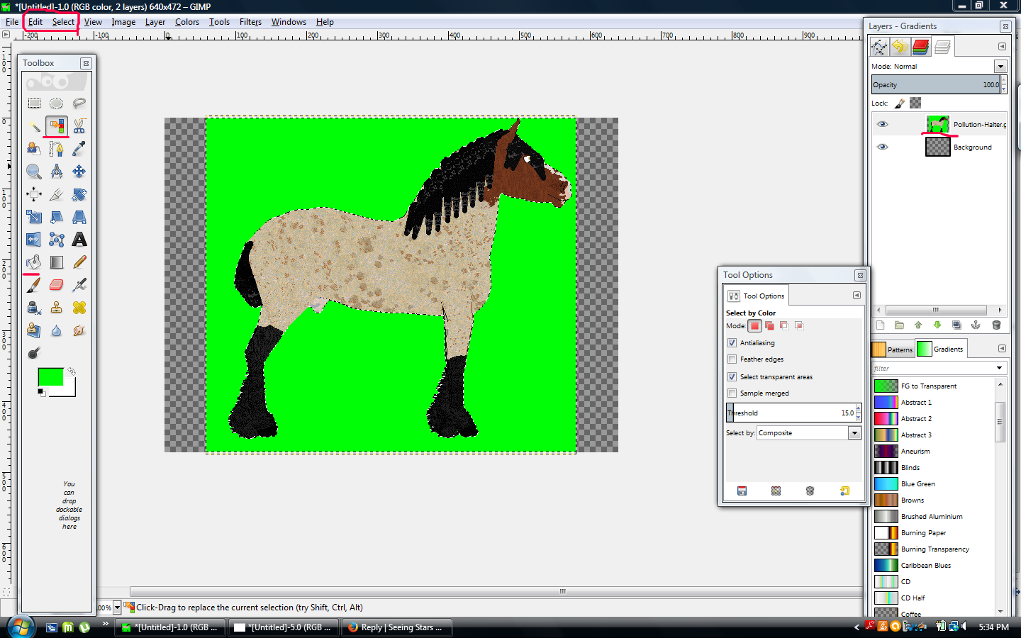
Go to your Layers-Gradients toolbar and right-click the background layer and select 'Add Alpha Channel'. Then select the 'Color Select' tool from the Toolbox and click your image to where there is a flashing dotted line around the border. Then click the Edit tab and click 'Cut', after that click the Select tab and click 'None'.
Step 3
Go to File and Open as Layers. Select your horse image, right click the horse layer like you did the background and add alpha channel. Then use the Bucket Fill tool and fill in the white with a unnatural color (I use bright green), then color select and cut, and then select none.
You can right-click the image and view it in a new tab if you want a larger view.
Step 4
Now for tack! Open your tack 'open as layers.' Then use the eraser tool to erase all the tack you do not want to use! Move the tack to fit where you want it. You can erase any extra bits where the tack sticks out into thin air, like if a bridle is too big.
If it's in a weird position, you can use the rotate tool from the toolbox. Though be wary, the more you rotate, the more blurry the tack layer will become (I'm not sure how to get around this)
Step 5
If the tack doesnt fit, zoom in really close and use the paintbrush (or pencil) tool at size 1 so it's just a pixel and match the tack color, lengthen the tack by drawing by pixel for best results!
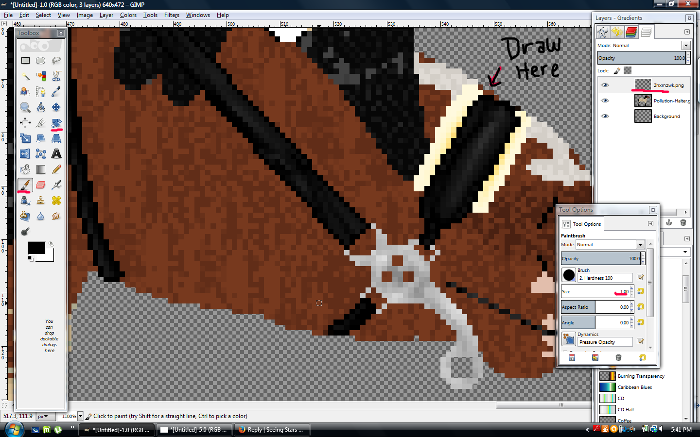
You can right-click the image and view it in a new tab if you want a larger view.
Step 6
Do this for all of your tack, then go to File and Export as a .png file; and you're done! Make sure to crop it so it's not too big.
I'm not very great at explaining but hopefully this helps!
Custom Reins or Tack
This is another great short tutorial by Pollution that shows how to easily make reins in any shape or width you like. You can ALSO use this and take it a step further and create bridles, halters, leads and other tack as well.
Some tack comes with reins but 90% of the time the reins don't fit or they're too flat/too curved etc. and being able to quickly make your own will save you so much time rather than fiddling with the premade ones.
--------------------
Until this year I had no idea about this tool, so my reins were super sloppy most of the time. Hopefully this will help you guys out if you didn't know about it!
*Also right-click > view image if you need a zoomed in view on some of these :)
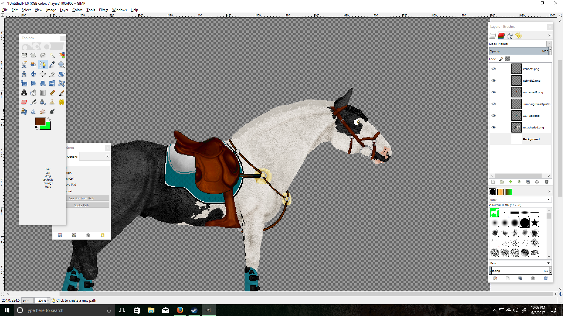
1.) Assuming you already know how to tack up your horse, we will start from here! Our lovely model is my Oldenburg "Tesla!"
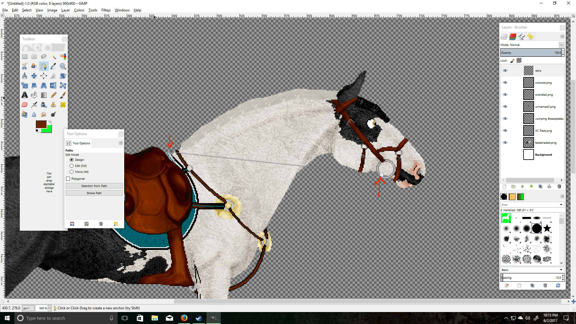
2.) We are going to use our eyedropper tool to grab the color of our bridle so the reins will match!
3.) Make a new transparent layer on top, I named mine "reins."
4.) Set your pencil/brush size to 3 (or any width you like for your reins.)
5.) Select the "Paths" tool, this is our magic tool for making reins!
6.) Using the paths tool, click where you want your reins to start & click a second time where you want them to end.
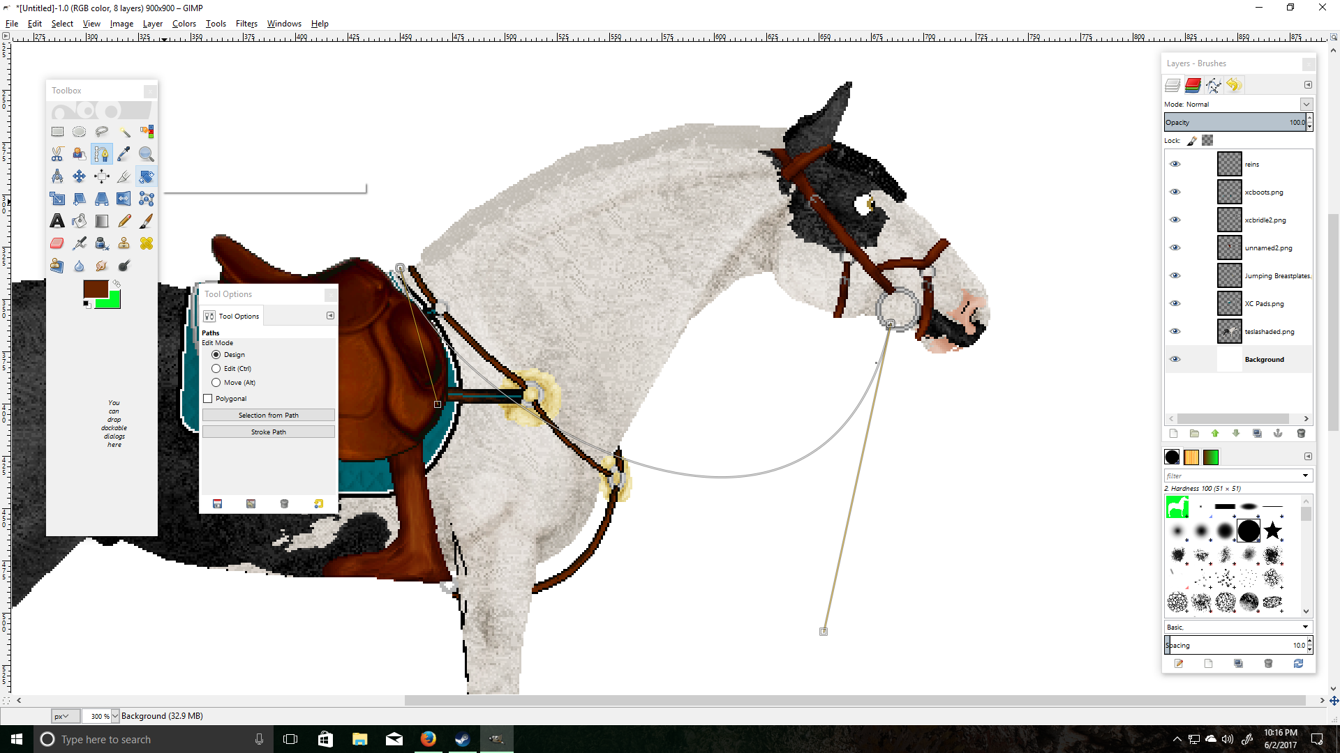
7.) Now click & drag your line to make the shape of your reins, I made mine fairly loose because there's no rider holding them.
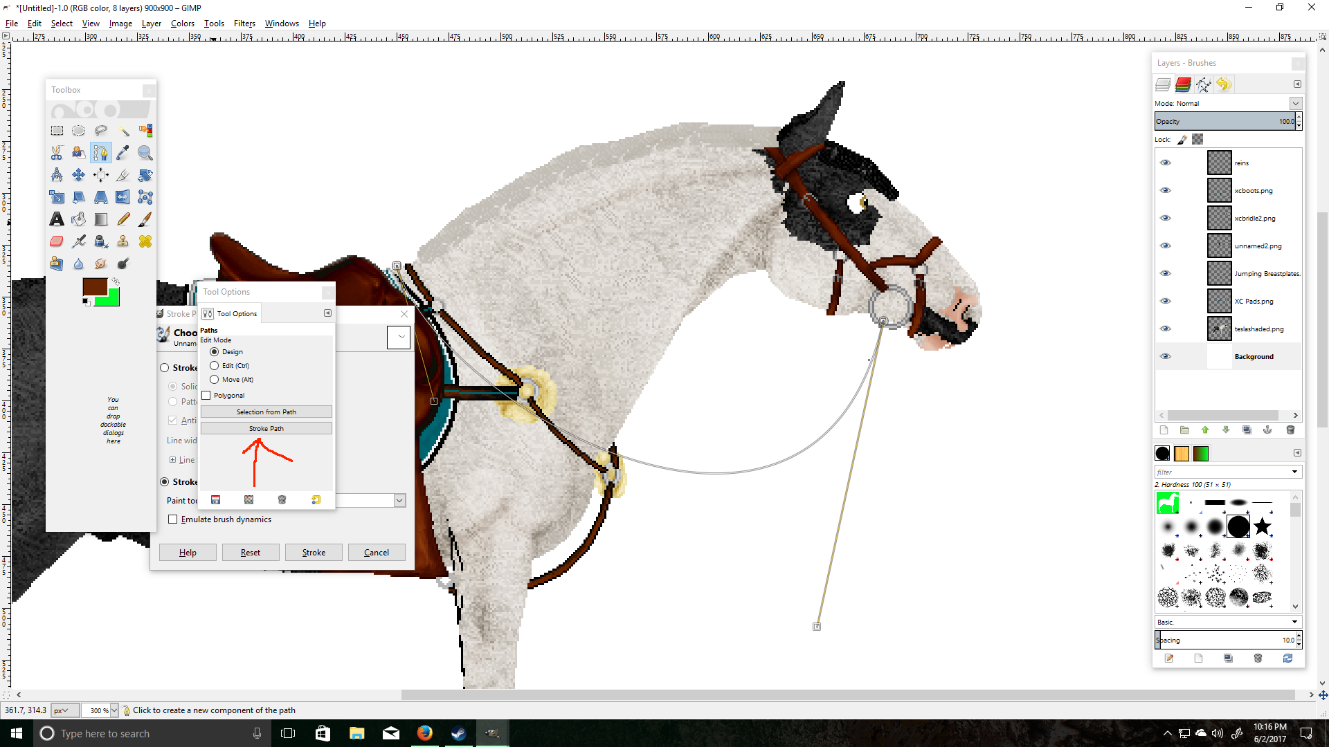
8.) When you are happy with your shape, select Stroke Path > Stroke With a Paint Tool (I chose pencil tool for pixel lines) > Stroke.
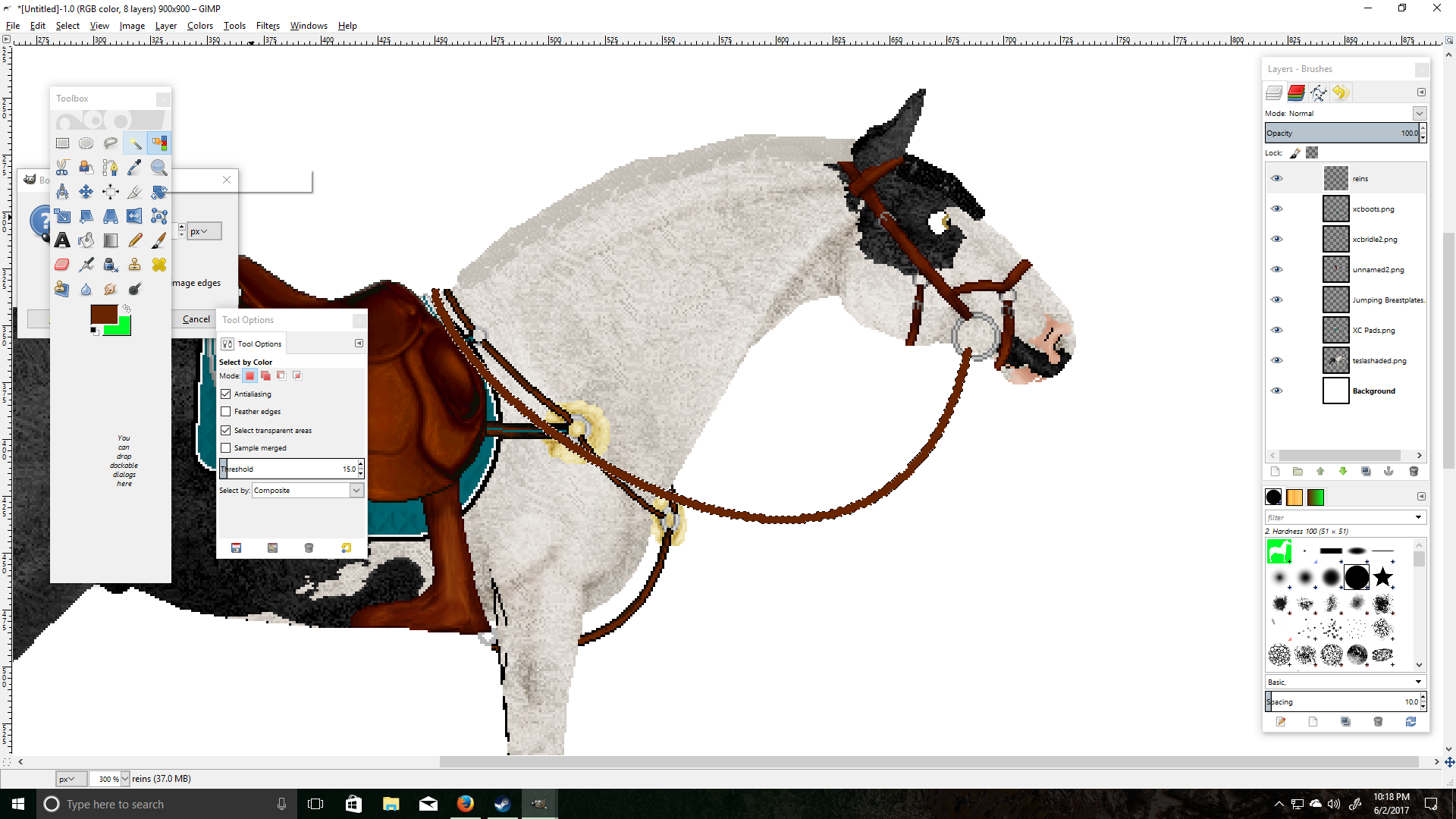
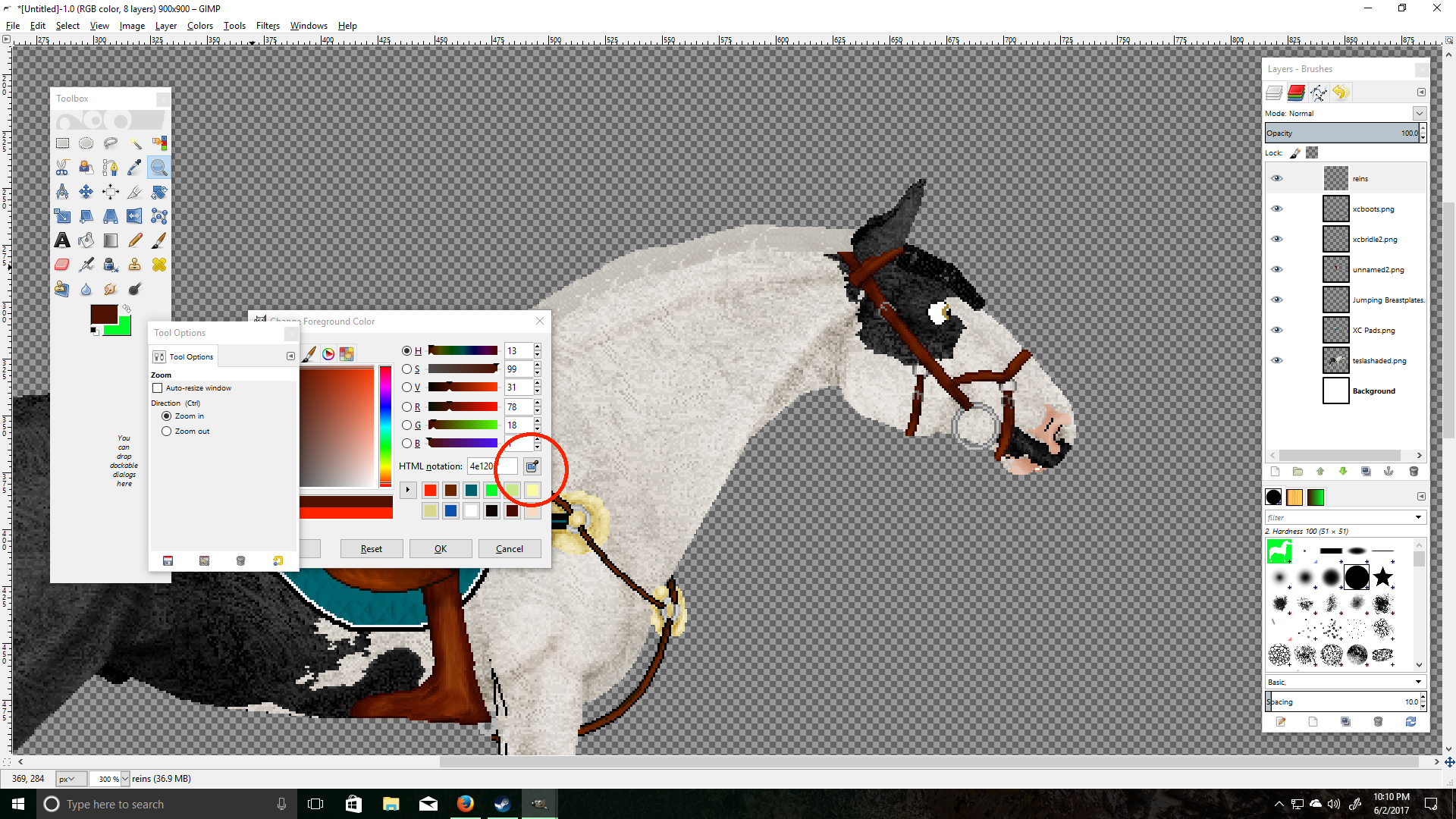
9.) Now that we have our line, we are going to use our "Select by Color" tool.
10.) Click anywhere but your line so it selects the area surrounding your line.
11.) Go to your top bar > Select > Border > 1px > Lock Selection to Image Edges > OK
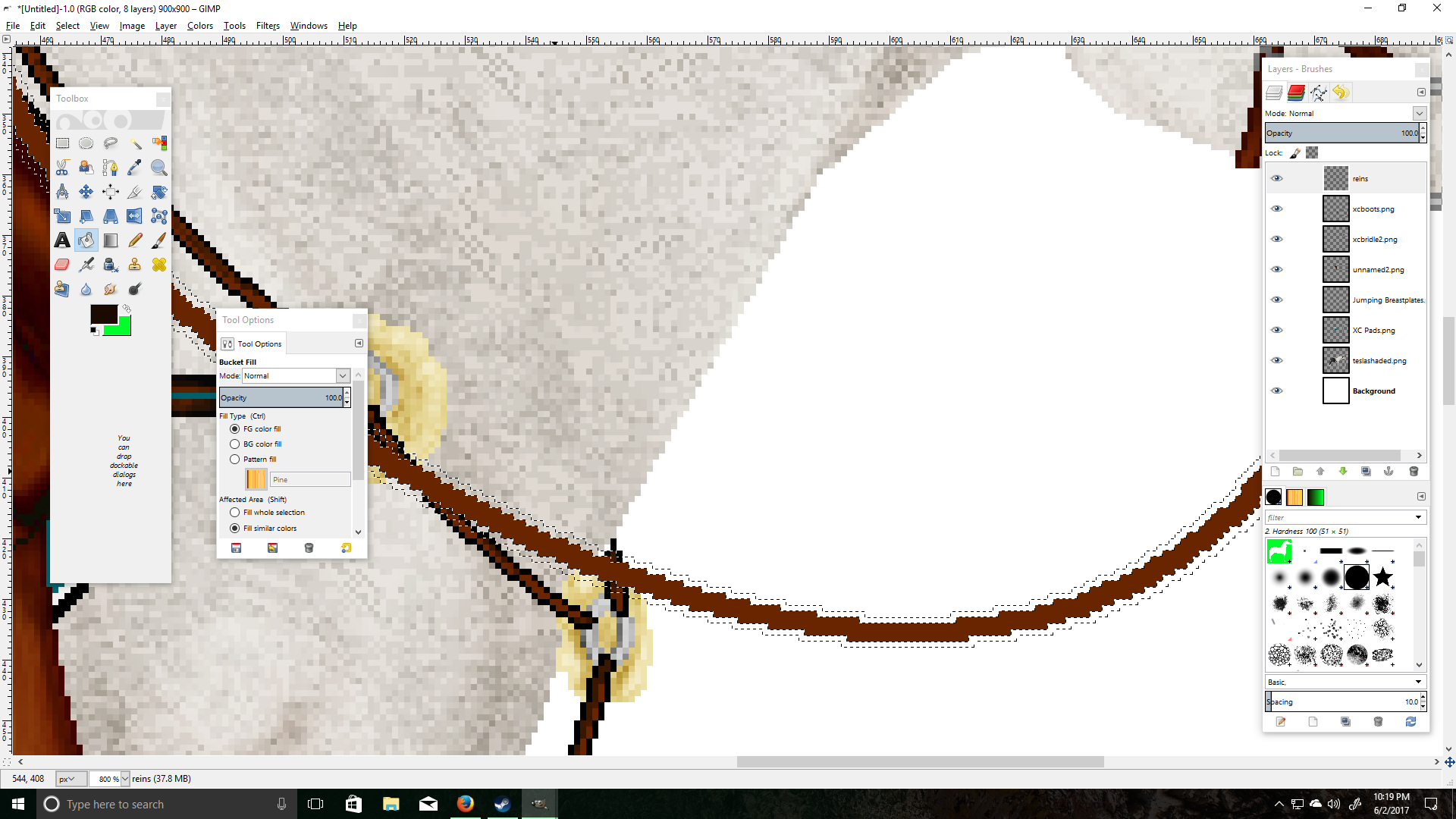
12.) Now your selection should look like this & we will select the "Bucket Fill" tool.
13.) Choose a dark color, I chose a darker shade of orange-brown.
14.) Fill in your border selection with bucket fill.
15.) Go back to your top bar > Select > None
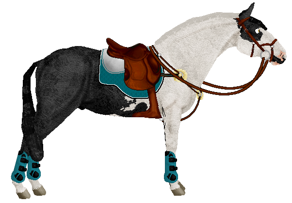
16.) You should have a neat reins line now, I usually duplicate the layer and move it behind my horse so I have both reins!
17.) Feel free to play around with all of these settings, these are just my personal preferences. Hope this helps ♥
Shading
Shading is usually one of the first things you do when you edit a picture/pose, the very first being getting it on a transparent background. However, shading isn't required for showing and therefore has been delegated to lower on the page.
There are a few ways to go about shading, the main two are by using the dodge and burn tools in an image editor or by doing a greyscale layer.
The first shading guide is the one I learned on and it's by Haybenny.
--------------------
This tutorial is only on shading and highlighting, since this is about all I do to my horses when I am showing them in the In-Hand shows. I will be going over how to shade and highlight, including the tools to use. I will also be going over where to place the shading and highlights.
*I USE PHOTOSHOP, I AM NOT SURE HOW THESE TOOLS AND TECHNIQUES WILL TRANSLATE TO OTHER PROGRAMS*
OK HERE WE GO!! FASTEN YOUR ARTSY SEAT BELTS GUYS!
How to shade and highlight, setting up your editing program
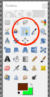
1. General: Know your tools
This step is pretty easy, you will need to use your "burn" (shading) tool, and your "dodge" (highlighting) tool!
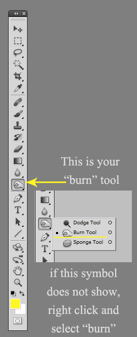
Next, find the "dodge" tool which will later be used for highlights. As seen in the picture above, this tool can be found by right clicking and selecting "dodge tool."
2. Shading: Burn tool
When using your burn tool, you will need to adjust some of the settings before you start to use it on your horse.

This is the tool bar you will use to adjust your settings. As you can see here, there are a few different options.
First, you want to select your brush size and hardness. I usually leave the hardness at 0, and put the size somewhere between 10 and 15 depending on the area I am shading and the size of the horse I'm working with. It is a good idea to start with a smaller brush, you can always add more!
The next part to look at is the Range. This also depends on the horse you are working with. If you are shading a white horse, you will select the "Highlights" option. If you are shading a black horse, select the "Shadows" option. These two settings should ONLY be used on the specific colors mentioned. If you are working with ANY other color, use the "Midtones" setting.
Last but not least, the Exposure. Like the brush size, you want this to be set somewhere between 10 and 15. Again, I strongly suggest starting at 10 and adding as you go. The darkness of your shading is up to personal preference.
3. Highlighting: Dodge tool
All of the same settings that go with the burn tool can also apply to the dodge tool.
OK HERE COMES THE FUN PART I HOPE Y'ALL ARE READY!
Your horse, where to shade and highlight
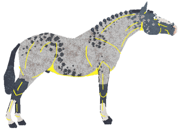
1. First, if you aren't familiar with the anatomy of the horse, it may help you to find a good conformation picture of a real horse.
We will use one here, and his name will be Cool-J. Hey Cool-J, it was so nice of you to come and help us.
Ok, so I know this horse is not facing the correct way that we like on SS BUT I picked him because you can see the muscular structure and his natural highlighted areas pretty well. He's also super pretty!
Obviously, there are a looottt of different spots on this horse that you could shade and highlight on your own horse. However, trying to add all of these different details may "over do" it (in my opinion). This does not mean that it can't be done and still look nice!
2. Decide what parts to shade
Now, we can take the picture of Cool-J and decide what parts we want to shade on our own horse. Here, I will outline the parts that I like to do, however you can choose to do less or more.
The yellow lines represent where I will shade using the burn tool:
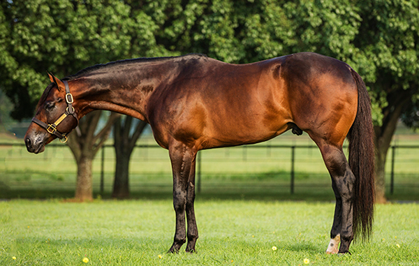
Ok! Now that we have decided where we want to place our shading, lets bring in a horse we want to show. Here I will use my main man Declan!
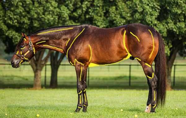
First, I have added the yellow lines to show where to shade. DO NOT do this, it is just to show you placement!
A lot of this is left up to imagination. Obviously your petz horse will not have defined muscluar areas i.e. the shoulders. Use your best judgement to decide where these features would lie on your horse.
3. Decide what parts to highlight
As you can see, our friend Cool-J is SUPER shiny. This makes it really easy to see where we might want to put our highlights with the dodge tool. Again, you can decide exactly how much highlighting you wish to add.
Poor Cool-J. Now, the yellow lines still represent the parts you have decided to shade, and the "mint" color represents where you want to apply highlights.
Declan time! Again, do not add these colored lines to your horse as this is only done for a reference! Like the shading, highlighting needs some imagination! Do your best to determine where the highlighted features would be.
GOOD JOB GUYS! YOU HAVE NOW SHADED AND HIGHLIGHTED YOUR HORSE!
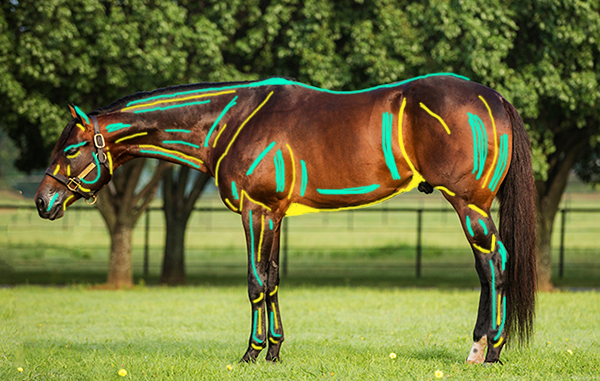
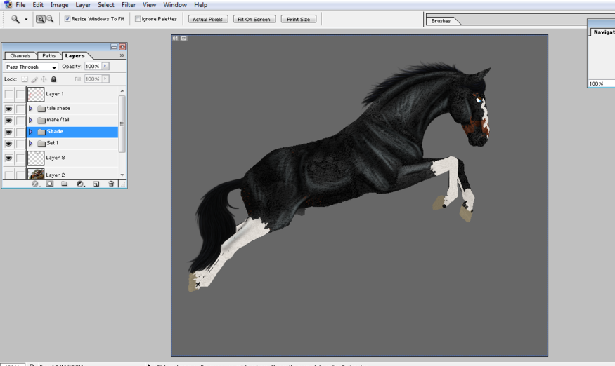
Just add tack!
The finished product :)
I hope you guys liked my tutorial and I hope it helps!
--------------------
The following tutorial is how to shade using layers and greyscale by Tatty.
Freeform Editing + Mane & Tail
Showmanship is the only discipline that allows editing this extreme, but when done right, it can look amazing!
This is the only guide out there so far for freeform editing but luckily it also includes a bit about drawing manes and tails.
Here is Bako's Handy Dandy Showmanship Tutorial!
I know a couple of people have been looking for some help when it comes to showmanship entries and just editing in general, so I thought I'd put together a little tutorial to explain how I personally edit. There are heaps of different ways to do this, but this is what I've found works for me. I have written this assuming the basics of whichever editing program you're using are known. I'm using Photoshop 7 and a graphics tablet, but this tutorial should still work for programs like GIMP and certain steps need to be swapped around a little if you don't have a tablet, but I'll explain that when we come to it ;)
Step 1- Pick your pose!
First step is of course, decide what you want your horse to be doing! Is he an eventer leaping over a ditch? A cow horse working stock? A hunter? Its up to you! Once you've picked your pose, draw up a rough sketch. If you need to, its really helpful to look up some stock images of a real horse performing the task, helps you get everything as accurate as possible.
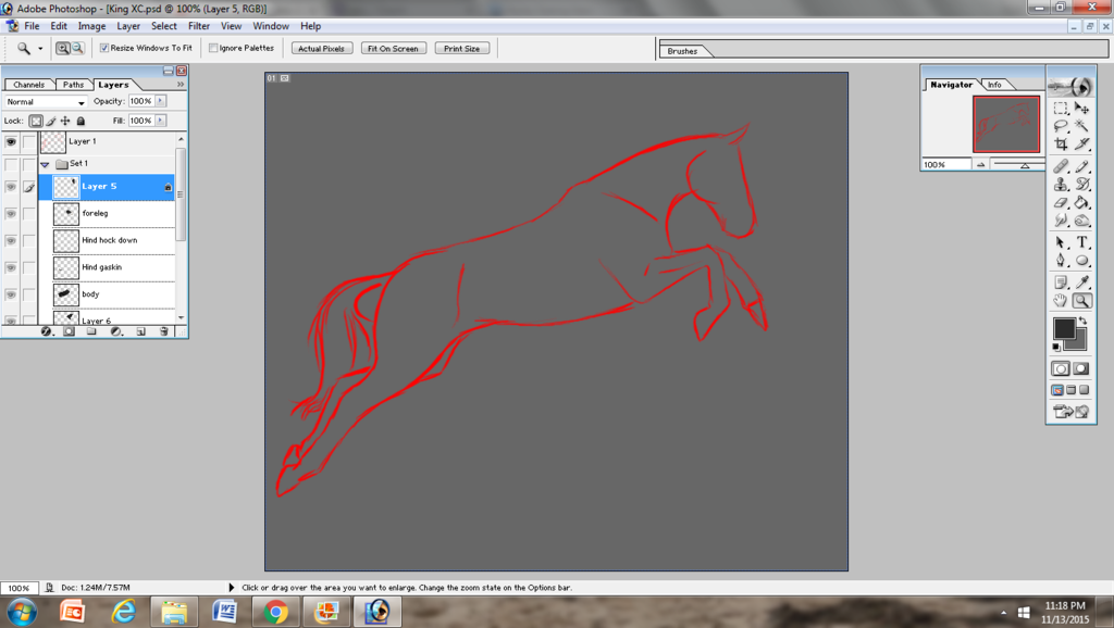
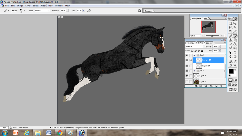
This is the pose I've chosen for King who is going to be an eventer on the cross country course! The sketch does not need to be super detailed, just a rough estimate of where everything needs to be. I do this on a new layer with just the general paint brush tool, background is grey so I can see what I'm doing lol
Step 2- Assemble the pieces!
This is the messy step lol. It is possible to make your pose out of a standing/comformation pose, but they end up messy and often more trouble then they're worth. So, instead I bring out the horse I'm making the pose for and take literally a million pictures of different poses and positions, which I can then cut together to make one image. The gallop and trot cycle is quite helpful in most cases, but for certain jumping poses you need the jump cycle too. For Dressage images, I'll take a couple with the horse's head in different positions so I can pick one which fits the pose. There is probably a much more effective way of doing this, but I don't know how to fix the blurriness you get after rotating an image, so I try to avoid it.
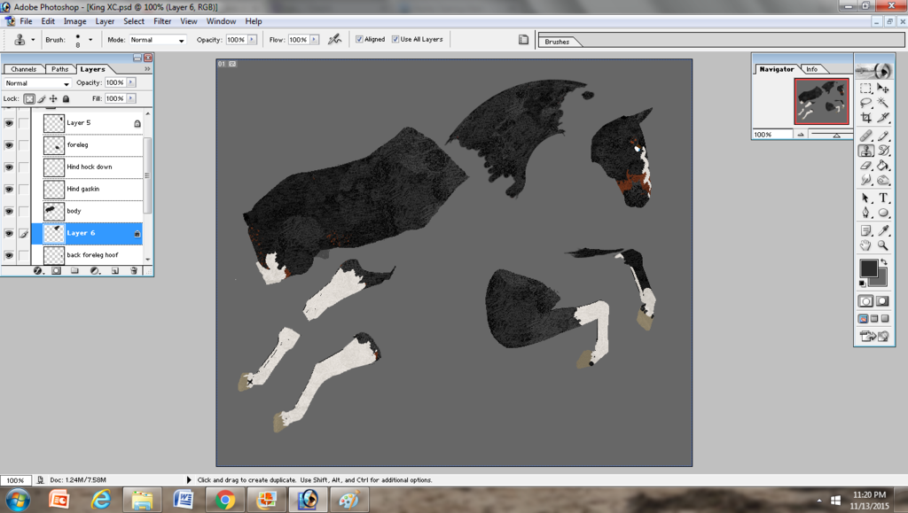
So as you can see, these are all the pieces for King's pose and each is on a different layer; and even then the foreleg/shoulder was actually three seperate parts, I'd just combined the layer before I took the screen shot. When cutting for limbs, I'll usually take the hindquarter/shoulder as well, as it helps with positioning and smoothing out the body shape if you need too. Necks can be tricky, especially when you need a nice curve, like in this particular pose. So, I use the clone tool and actually draw the neck myself, plus it removes the need for me to edit the mane out later. It's more than possible to use a neck from an in-game pose, just pick whatever flows with the pose! The clone tool is also awesome for filling in gaps between each piece, editing out the mane/tail or smoothing out areas on the body.
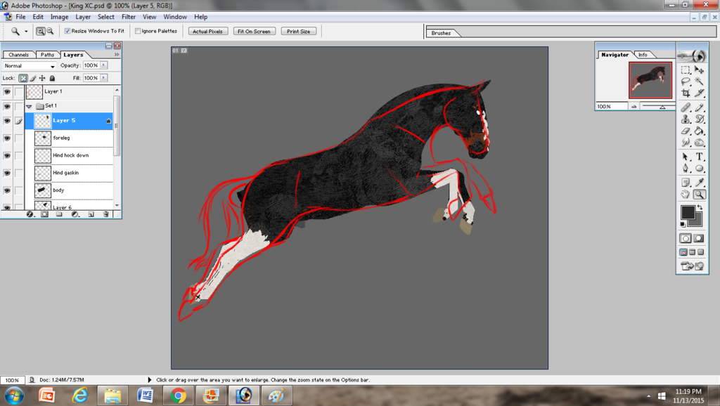
Step 3- Puzzle Time!
Flick your sketch layer back on if you've turned it off and move each piece to its equivalent spot. Each piece should be on its own layer, so it's easy to move around and not disturb the other bits. The way I set my layers up is use the body as the base, then legs on the side closer to you/the observer on top of that layer and legs on the off side below the body layer. You can see a little if you look over in the little layer box, though I haven't named them all at this point lol. Neck and head sorta depend on the picture, so have a play around with them and pick which is nicer. Neck below body, then head above neck is usually pretty good. Also, don't be afraid if your pose doesn't fit exactly into your sketch. As you can see, my sketch was far too long, but if I'd changed King's pose to fit the sketch, he would have ended up looking out of proportion and a bit flat. Your sketch is a guide, not a rule! Change and edit things if you feel it looks nicer and keeps the flow of the pose!
Step 4- Mane and tail edits!
Now we've got a finished pose, we can start the fun bit! I always make a new set for my mane and tail edits because I usually end up with a crud ton of layers. Like so many. Anyway, to begin, you need to draw a base for your mane/tail. Picking a midtone colour from the horse's coat/mane usually works fine, but blacks and whites are a bit trickier. For blacks, picking a grey serves as a good base and for white, a light cream colour.
The hard part comes in when you go shade. Using pure black or pure white often leaves the tail looking flat in a black and dirty in a white. So instead, I like to work in grey blues and white blues. It really helps give some depth and shine to the tail. For whites, working on the yellow/cream scale works too. For any other colour, pick colours darker and lighter than your base, but keep on the same sorta scale. How dark and how light you need to go depends on the base colour, so have a play around with a few different ones before settling on one. You can also lower the opacity of each layer, which can save you from fiddling around with multiple shades.
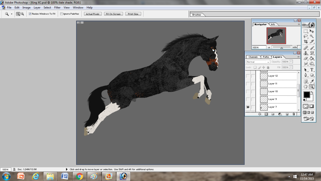
Step 5- Body shading!
Now I do my body shading before I add any tack, I just find it easier and I'm less likely to miss parts or shade incorrectly. Not that shading is my strong point in any case! To begin, I draw out my 'base', basically where the very basic muscle and bone structures are. So shoulder, cheeks, neck crest and gavlin's groove, flank and hindquarter. This layer is usually then blurred the tiniest bit to soften the edges and moved to a low opacity. Again, try not to use straight blacks/whites and pick a dark colour from your horse's coat and then a light one for highlights later on.
Next, I use the opacity brush and 'fill in the gaps'. This a pressure sensitive brush, so it wont work if you don't have a tablet. Fear not! Using the soft brush achieves the same effect, you just need to use a couple more layers. If your using the soft brush, follow the same principle as the mane, general shadow/highlight at a low opacity if needed, then your specific shadows and highlights on the next layer up.
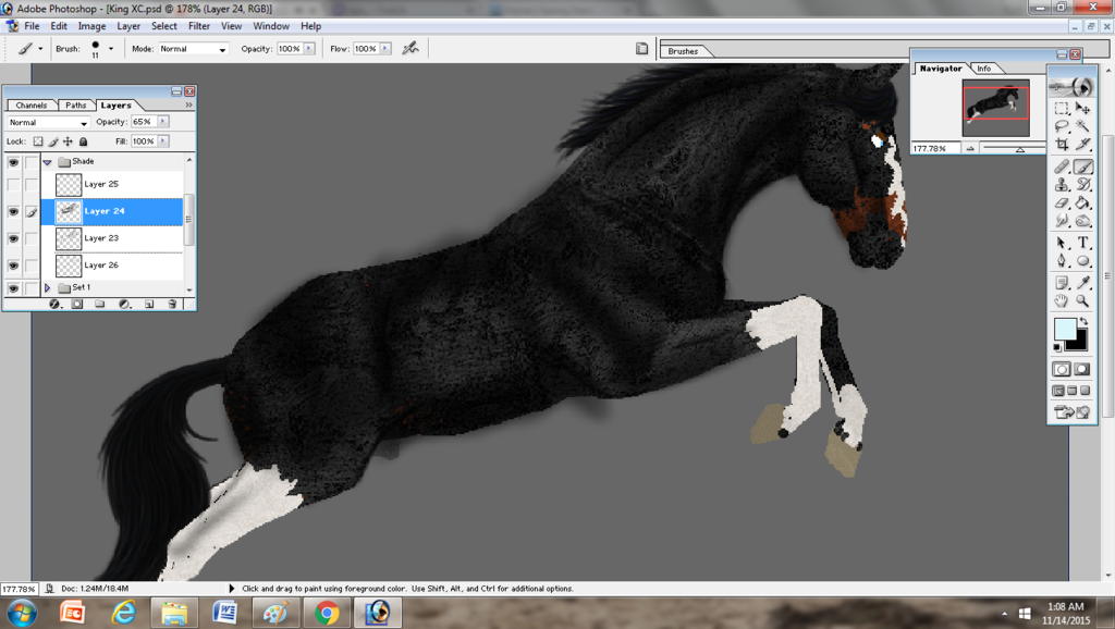
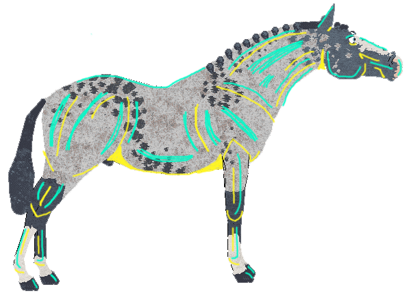
This is King's finished shadows, before I've fixed the opacity or cleaned up where I've drawn over. But you can see where the base shadow comes in to provide a bit of definition between each part. From here we move onto highlights.
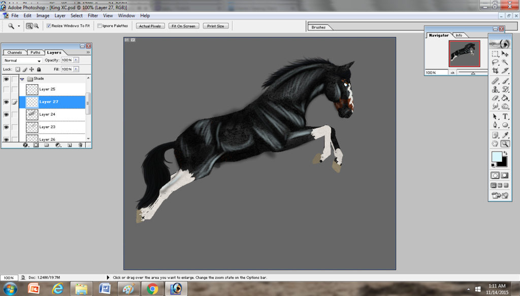
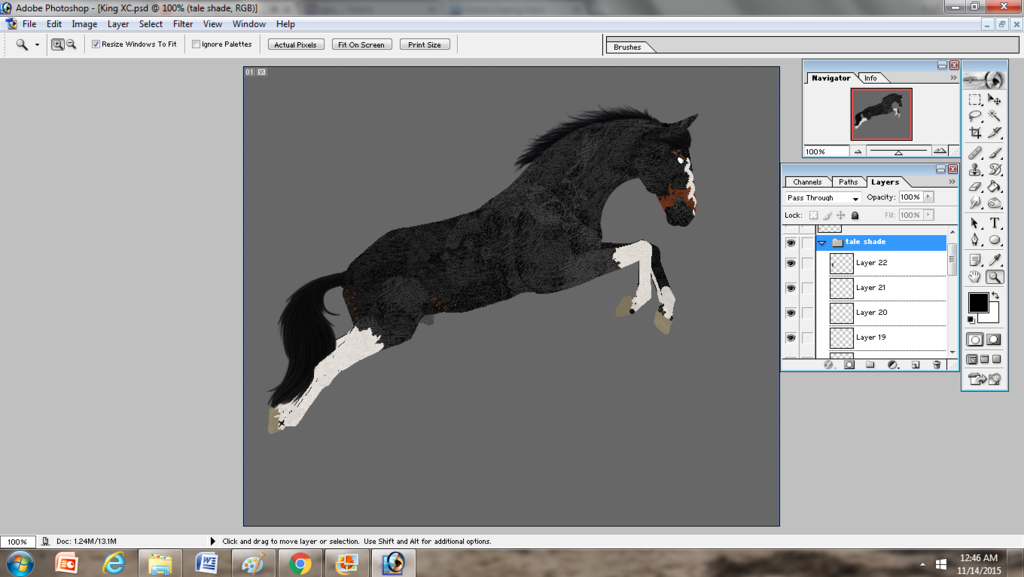
Again, I've used the opacity brush, so I've only needed one layer and you just follow what you did with the shadows. The main areas for highlights are the neck, shoulders and then the top of the rump. Looking back at stock photos is SUPER helpful for shading and I frequently do it. Learning the muscle structure of the horse really helps.
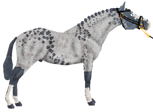
And there's the finished pose after fiddling with the opacity and then cleaning up the shading layers. King is ready to tack up!